Scaling Design for 18M+ Insurance Customers
Tata AIG is a highly ranked private general insurer in India protecting over 2 million customers with trusted insurance solutions backed by Tata and AIG.
Redesigned the insurance platform with a mobile-first approach, optimizing the user journey to reduce time-to-task and implemented a payment-first strategy to streamline checkout specifically for health and auto insurance.
Redesigned the insurance platform with a mobile-first approach, optimizing the user journey to reduce time-to-task and implemented a payment-first strategy to streamline checkout specifically for health and auto insurance.
Team
Team
Team
2 Project Managers, 2 UX + 4 UI Designers
2 Project Managers, 2 UX + 4 UI Designers
Timeline:
Timeline:
Timeline:
6 Months
6 Months
My Role:
My Role:
My Role:
User research, design system, UI, development handoff
User research, design system, UI, development handoff
million monthly visits
million monthly visits
Agents affected
Agents affected
Policy purchase time cut
awards won
awards won
Problem
Currently, users often find insurance platforms overwhelming and intimidating. The multi-step process and information overload contribute to decision fatigue, ultimately causing many to abandon their journey before completing a policy purchase.
Solution
Introduced a fresh interface design - neumorphism to set TATA AIG apart from competitors, while streamlining the user experience to reduce drop-offs and boost conversions.
Introduced a fresh interface design - neumorphism to set TATA AIG apart from competitors, while streamlining the user experience to reduce drop-offs and boost conversions.
Slide to see the before and after
Slide to see the before and after
Context
Worked across a multi-sided insurance ecosystem, designing experiences for both customers and agents, each with distinct goals, behaviors, and constraints.
Worked across a multi-sided insurance ecosystem, designing experiences for both customers and agents, each with distinct goals, behaviors, and constraints.

Research
Analysed existing traffic, conversion and 3 months of call centre data
Analysed existing traffic, conversion and 3 months of call centre data
The analysis showed that users were taking too long to reach a quote for the insurance premium across offerings.
There was also no clear communication about how many steps were left to complete the process of getting a quote.
The analysis showed that users were taking too long to reach a quote for the insurance premium across offerings.
There was also no clear communication about how many steps were left to complete the process of getting a quote.

Each insurance vertical (e.g. motor or health etc) has multiple buy, proposal, renewal, rollover, and service flows, indicating different user types (customers, agents, underwriters) and scenarios. While the overall flow structure and components remain consistent, each journey incorporates nuanced variations based on context and user needs.

Each insurance vertical (e.g. motor or health etc) has multiple buy, proposal, renewal, rollover, and service flows, indicating different user types (customers, agents, underwriters) and scenarios. While the overall flow structure and components remain consistent, each journey incorporates nuanced variations based on context and user needs.
Each insurance vertical (e.g. motor or health etc) has multiple buy, proposal, renewal, rollover, and service flows, indicating different user types (customers, agents, underwriters) and scenarios. While the overall flow structure and components remain consistent, each journey incorporates nuanced variations based on context and user needs.
Analysed existing traffic, conversion and 3 months of call centre data
The analysis showed that users were taking too long to reach a quote for the insurance premium across offerings.
There was also no clear communication about how many steps were left to complete the process of getting a quote.
Beyond the competitors
While competitive sites were analysed, I looked beyond the insurance industry.
For features like delivery, food delivery apps like Swiggy and Zomato were considered.
For insurance-specific features, global examples like Lemonade and nascent Indian ventures like Acko and Digit were studied.
While competitive sites were analysed, I looked beyond the insurance industry.
For features like delivery, food delivery apps like Swiggy and Zomato were considered.
For insurance-specific features, global examples like Lemonade and nascent Indian ventures like Acko and Digit were studied.
For features like delivery, food delivery apps like Swiggy and Zomato were considered.
For insurance-specific features, global examples like Lemonade and nascent Indian ventures like Acko and Digit were studied.
While competitive sites were analysed, I looked beyond the insurance industry.
For features like delivery, food delivery apps like Swiggy and Zomato were considered.
For insurance-specific features, global examples like Lemonade and nascent Indian ventures like Acko and Digit were studied.
While competitive sites were analysed, I looked beyond the insurance industry.
For features like delivery, food delivery apps like Swiggy and Zomato were considered.
For insurance-specific features, global examples like Lemonade and nascent Indian ventures like Acko and Digit were studied.
For features like delivery, food delivery apps like Swiggy and Zomato were considered.
For insurance-specific features, global examples like Lemonade and nascent Indian ventures like Acko and Digit were studied.
Design Decisions
Rather than a one-size-fits-all approach, the issue was tackled with customized interventions tailored to each business.
Rather than a one-size-fits-all approach, the issue was tackled with customized interventions tailored to each business.
Mobile First Approach
Mobile First Approach
Since the majority of users accessed the site via mobile devices, a mobile-first approach was adopted. This approach also required me to prioritize the most essential features and content, given the constraints of limited screen space.
Since the majority of users accessed the site via mobile devices, a mobile-first approach was adopted. This approach also required me to prioritize the most essential features and content, given the constraints of limited screen space.

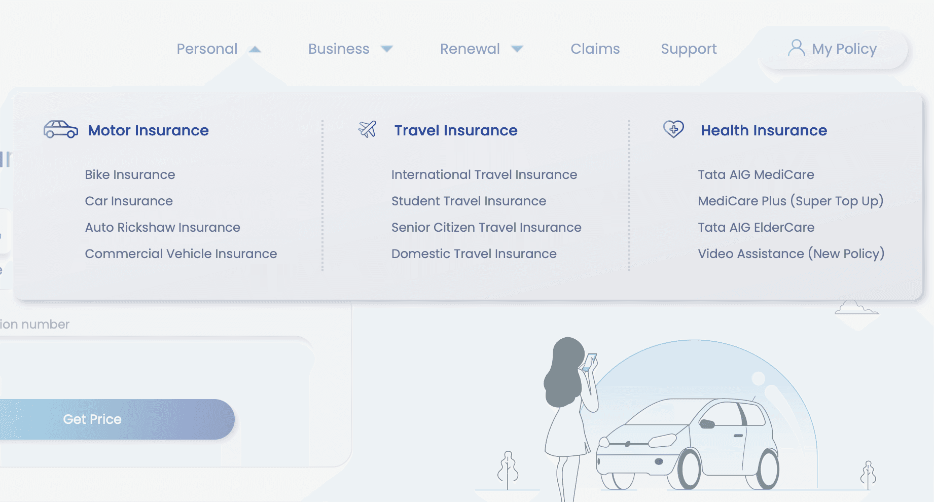
Reducing Choice Paralysis
❌ Users has to over-think their needs and too many options were causing confusion.
✔️ By streamlining the number of packages offered on the site, especially in areas like global navigation and motor insurance categories, users were able to make decisions more quickly and with greater ease.
❌ Users has to over-think their needs and too many options were causing confusion.
✔️ By streamlining the number of packages offered on the site, especially in areas like global navigation and motor insurance categories, users were able to make decisions more quickly and with greater ease.
Reducing Choice Paralysis
By streamlining the number of packages offered on the site, especially in areas like global navigation and motor insurance categories, users were able to make decisions more quickly and with greater ease.
Third Party Integration
❌ Users needed to fill in copious amounts of detail to generate a quote.
✔️ For motor insurance, the new website integrated with the public 'Vahan' database, allowing users to simply enter their name and registration number, with all remaining details automatically populated.
❌ Users needed to fill in copious amounts of detail to generate a quote.
✔️ For motor insurance, the new website integrated with the public 'Vahan' database, allowing users to simply enter their name and registration number, with all remaining details automatically populated.
90%
reduced manual effort and 5 steps of data entry
Third Party Integration
For motor insurance, the new website integrated with the public 'Vahan' database, allowing users to simply enter their name and registration number, with all remaining details automatically populated.
90%
reduced manual effort

Interface Design
A neumorphic visual design was introduced to give insurance products a fresh and distinctive look. By using soft, subtle effects, the design set the brand apart from its competitors.
A neumorphic visual design was introduced to give insurance products a fresh and distinctive look. By using soft, subtle effects, the design set the brand apart from its competitors.
A neumorphic visual design was introduced to give insurance products a fresh and distinctive look. By using soft, subtle effects, the design set the brand apart from its competitors.

Design System
Simuntaneously, I led the the creation of a neumorphic design system, defining component-level shadows, states, and usage guidelines to ensure consistency and ease of adoption for future designers.


Design System
Simuntaneously, I led the the creation of a neumorphic design system, defining component-level shadows, states, and usage guidelines to ensure consistency and ease of adoption for future designers.
What Did I Learn?
🌐 Domain Specific Onboarding
Joining the project midway taught me how important it is to truly understand the insurance domain before designing. The complexity and regulations meant that not everything could be redesigned, and learning to work within those limits shaped how I approached problem-solving.
🎡 Don't reinvent the wheel
While redesigning the insurance platform, I intentionally retained familiar, insurance-specific terminology such as quotes and premium calculator, to ensure the experience felt aligned with what users were already accustomed to.
In The Press
In The Press
More Projects
More Projects
More Projects


Like what you see?
Open for collaborations & internships, don't shy away from a chitchat :)
crafted with love 💌 and chai ☕ by @Akanksha 2025
A New Look For Insurance
TATA AIG is a highly ranked private general insurer in India protecting over 2 million customers with trusted insurance solutions backed by Tata and AIG.
