Design for People at Work

Bayer Crop Science is leading pharmaceutical company where I was part of the team 'Enabling Functions' that supported Bayer under the hood through its internal tools

As part of the foundational design team, I was responsible for steering engineering focused team into a deign one, while introducing design thinking into 7+ internal applications used by employees.

Team

Team

Team

1 Project Managers, 2 UX Designers + 2 Developers, 2 Data Scientist

1 Project Managers, 2 UX Designers + 2 Developers, 2 Data Scientist

Timeline:

Timeline:

Timeline:

1.5 years

My Role:

My Role:

My Role:

User research, design system, UI, development handoff

User research, design system, UI, development handoff

0+

applications redesigned to improve employee productivity

0+

applications redesigned to improve employee productivity

0+

employees trained with human centered design practices

0+

employees trained with human centered design practices

0%
0%

Time reduction in task completion

Problem

Currently, there are multiple external presentations that forces the communication team to spend a lot of time to strategise the content for various social media channels based on a pool of presentations.

Solution

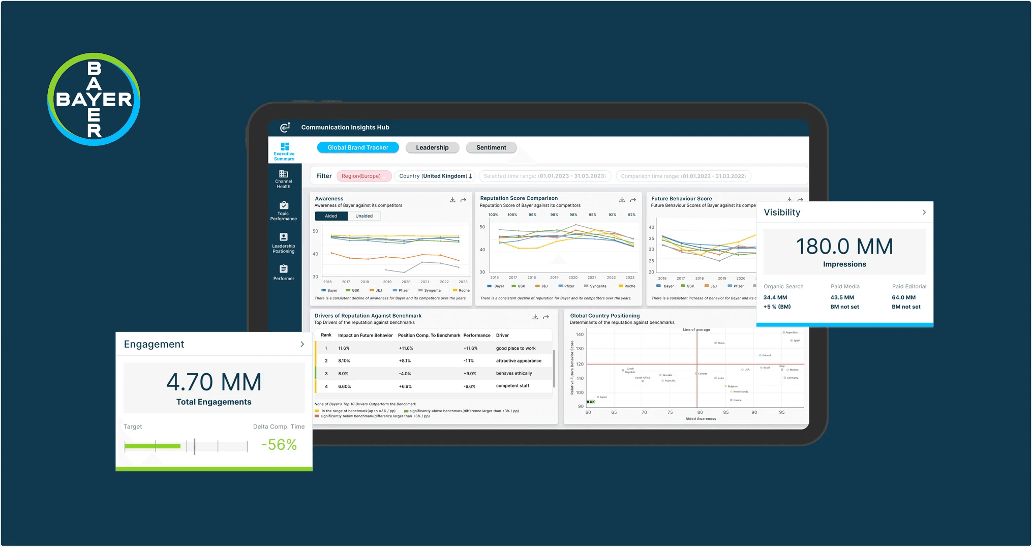
Translating multiple sources of presentation into a holistic PowerBI dashboard that reduces the efforts of the communication team to sift through presentations and enable a faster decision making process.

Slide to see the before and after

Slide to see the before and after

Making sense of the research

I joined the project midway during organizational changes and focused first on understanding the existing research, then built on it by leading stakeholder interviews.


Teams spent significant time sifting through numerous presentations to find the right information.

Teams spent significant time sifting through numerous presentations to find the right information.

Users couldn’t interact with the data - no way to filter, explore, or compare key information.

Users couldn’t interact with the data - no way to filter, explore, or compare key information.

Lack of any user guidance, comparison and intelligence to support interpretation.

Lack of any user guidance, comparison and intelligence to support interpretation.

Making sense of the research

I joined the project midway during organizational changes and focused first on understanding the existing research, then built on it by leading stakeholder interviews.


Constraints

Three significant limitations were identified in the beginning of the project


Constraints

Three significant limitations were identified in the beginning of the project


How Might We's?

Three major categories of HMW's were framed through the stakeholder interviews and understanding the business requirements.


Design Decisions

For the first launch of the dashboard, we implemented three major design decisions.

For the first launch of the dashboard, we implemented three major design decisions.

Data Visualisations

Data Visualisations

For each user story, data from the presentations were converted into intuitive & interactive visualisations for easy interpretation of data.

For each user story, data from the presentations were converted into intuitive & interactive visualisations for easy interpretation of data.

Adaptive Top Down Navigation

Multiple iterations of the left navigation was explored. As the complexity increased, we realised that we need to move from 2 level navigation to 3 levels.

Feasibility on Power BI without customisation at the development front was a major consideration here.

Multiple iterations of the left navigation was explored. As the complexity increased, we realised that we need to move from 2 level navigation to 3 levels.

Feasibility on Power BI without customisation at the development front was a major consideration here.

Data Visualisations

Multiple iterations of the left navigation was explored. As the complexity increased, we realised that we need to move from 2 level navigation to 3 levels.

Feasibility on Power BI without customisation at the development front was a major consideration here.

Interactivity

Features like filters based on region, time range, export/download of data, interaction with the visualisation were inculcated instead of static data.

Features like filters based on region, time range, export/download of data, interaction with the visualisation were inculcated instead of static data.

Third Party Integration

For motor insurance, the new website integrated with the public 'Vahan' database, allowing users to simply enter their name and registration number, with all remaining details automatically populated.

For a typical page, designs underwent multiple iterations to enhance prioritization, and visual balance for a more user-focused experience.

For a typical page, designs underwent multiple iterations to enhance prioritization, and visual balance for a more user-focused experience.

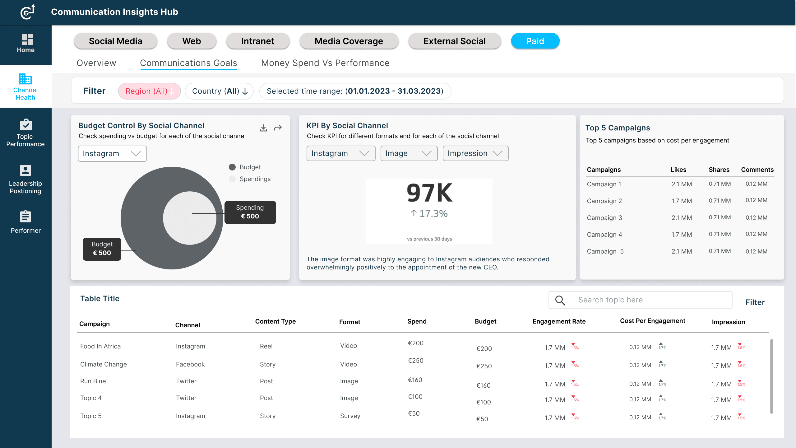
An example of 'Paid Social Media' page has been shown below.

An example of 'Paid Social Media' page has been shown below.

An example of 'Paid Social Media' page has been shown below.

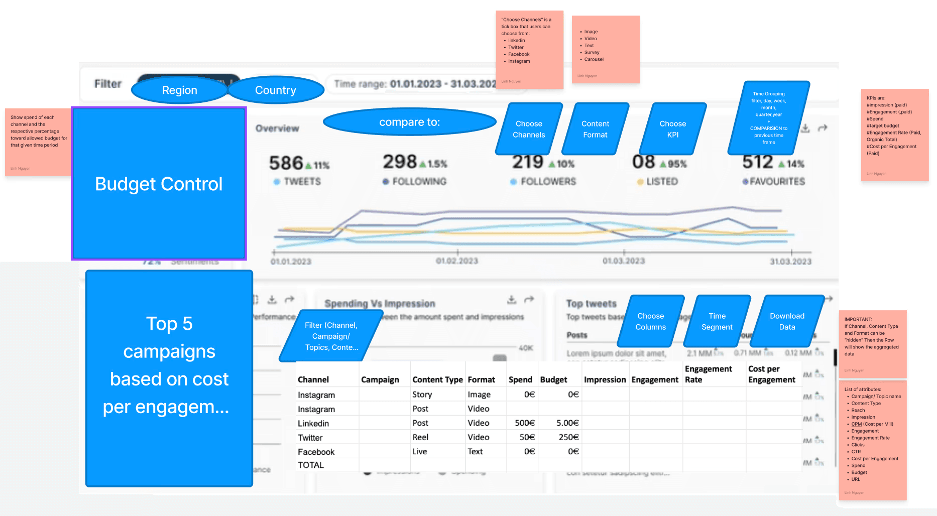
Even before the wireframing began, components were decided based on the user story

Compares budget vs. spending, tracks KPIs like impressions and engagement rates, and highlights the top-performing campaigns based on cost per engagement.

The Top 5 campaigns chart was removed in the next iteration as it was redundant due to the existing table. The comparison view was yet to be implemented

This iteration adds a comparison view for year-over-year analysis and introduces a KPI trend graph across channels for deeper performance insights. It also includes more detailed budget tracking and breaks down paid post volume by objective, offering a more comprehensive and strategic overview.

Even before the wireframing began, components were decided based on the user story

Compares budget vs. spending, tracks KPIs like impressions and engagement rates, and highlights the top-performing campaigns based on cost per engagement.

The Top 5 campaigns chart was removed in the next iteration as it was redundant due to the existing table. The comparison view was yet to be implemented

This iteration adds a comparison view for year-over-year analysis and introduces a KPI trend graph across channels for deeper performance insights. It also includes more detailed budget tracking and breaks down paid post volume by objective, offering a more comprehensive and strategic overview.

User Acceptance Test

14 Users

from the communication team participated in UAT, covering diverse roles and responsibilities.

Pre UT

  • Screening of the participants

  • Structured questionnaire with various tasks and scenarios were prepared

  • Unmoderated set up

Pre UT

  • Screening of the participants

  • Structured questionnaire with various tasks and scenarios were prepared

  • Unmoderated set up

During UT

  • Self-guided format to capture feedback

  • User enquiries were managed by readily available contact information of the experts

During UT

  • Self-guided format to capture feedback

  • User enquiries were managed by readily available contact information of the experts


User Acceptance Test

14
from the communication team participated in UAT, covering diverse roles and responsibilities.

Pre UT

  • Screening of the participants

  • Structured questionnaire with various tasks and scenarios were prepared

  • Unmoderated set up

During UT

  • Self-guided format to capture feedback

  • User enquiries were managed by readily available contact information of the experts


Findings

Each visualisation was tested with the real users to get their feedback.


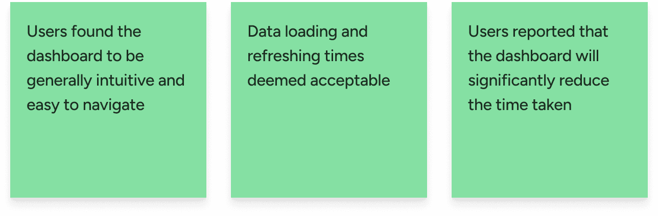
What Worked?

What Didn't Work?

Findings

from the communication team participated in UAT, covering diverse roles and responsibilities.Each visualisation was tested with the real users to get their feedback.

What Else Did I Do?

Setting UI guidelines for developement

Setting UI guidelines for developement

Setting UI guidelines for developement

Quality check + giving feedback to developers

Quality check + giving feedback to developers

Quality check + giving feedback to developers

Like what you see?

Open for collaborations & internships, don't shy away from a chitchat :)

crafted with love 💌 and chai ☕ by @Akanksha 2025

Communication Dashboard at Bayer

Bayer Crop Science is leading pharmaceutical company where I was part of the team 'Enabling Functions' that supported Bayer under the hood through its internal tools

Like what you see?

Open for collaborations & internships, don't shy away from a chitchat :)

crafted with love 💌 and chai ☕ by @Akanksha 2025

Bayer

Making financial data easier to understand

I redesigned key parts of a financial dashboard to improve transaction visibility, simplify navigation, and help users understand their finances faster during everyday workflows.

Role

Product Designer

Timeline

July 2025

Team

3 Designers

Platform

Web application

Overview

Making financial data easier to understand

Content

Problem

Understanding financial activity felt unnecessarily difficult

Content

Research

Looking beyond the numbers

Content

Ideation

Exploring interface directions

Content

Designs

Refining the dashboard experience

Content

Lessons

Designing for clarity, confidence, and everyday financial workflows

Content

Design for People at Work

Bayer Crop Science is leading pharmaceutical company where I was part of the team 'Enabling Functions' that supported Bayer under the hood through its internal tools

Bayer Crop Science is leading pharmaceutical company where I was part of the team 'Enabling Functions' that supported Bayer under the hood through its internal tools

As part of the foundational design team, I was responsible for steering engineering focused team into a deign one, while introducing design thinking into 7+ internal applications used by employees.

Team

Team

Team

1 Project Managers, 2 UX Designers + 2 Developers, 2 Data Scientist

1 Project Managers, 2 UX Designers + 2 Developers, 2 Data Scientist

Timeline:

Timeline:

Timeline:

1.5 years

My Role:

My Role:

My Role:

User research, design system, UI, development handoff

User research, design system, UI, development handoff

0+

applications redesigned to improve employee productivity

0+

applications redesigned to improve employee productivity

0+

employees trained with human centered design practices

0+

employees trained with human centered design practices

0%
0%

Time reduction in task completion

Problem

Problem

Currently, there are multiple external presentations that forces the communication team to spend a lot of time to strategise the content for various social media channels based on a pool of presentations.

Create a free website with Framer, the website builder loved by startups, designers and agencies.